Color palettes make planners more organized, functional, and visually appealing. They help separate sections, highlight priorities, and improve readability. Whether you’re managing tasks or tracking goals, using the right colors can enhance your planning experience.
For a Spring theme, use:
Start with a neutral base, add complementary colors, and keep accents minimal for clarity and style. Use stickers, washi tape, and markers to bring your palette to life.
A color palette is a set of carefully chosen colors that work well together to create a visually pleasing and organized design. In planners, they not only add style but also make it easier to navigate different sections.
Color palettes rely on three main principles: harmony, contrast, and balance. These principles ensure your planner is both functional and visually appealing. For instance, using darker tones for headers and lighter shades for tasks helps create a clear and organized layout.
Different types of color palettes can create distinct effects in planners:
| Palette Type | Description | Best Used For |
|---|---|---|
| Monochromatic | Variations of a single color | Clean, minimalist layouts |
| Analogous | Colors next to each other on the wheel | Smooth, seamless transitions |
| Complementary | Opposite colors on the wheel | High-contrast, bold sections |
| Triadic | Three evenly spaced colors | Vibrant, balanced designs |
For example, Dark Moon Paper’s ‘Lilac Dusk’ kit uses a monochromatic purple palette, demonstrating how a unified color scheme can boost both style and organization. On the other hand, their ‘Electric Forest’ collection showcases how diverse palette types can bring real planners to life.
When choosing a palette, think about both your personal style and how you’ll use your planner. A business planner might benefit from a professional complementary palette that separates appointments clearly. Meanwhile, a creative journal could shine with an analogous palette, offering a smoother, artistic flow between sections.
Your color palette should improve your planner’s usability, not make it harder to use. The right combination of colors can turn your planner into a visually effective tool that matches your planning style and makes your information easy to access.
Choosing a color palette for your planner is about more than just picking what looks nice. A well-chosen palette can make your planner both functional and visually appealing, while also fitting your personal planning style.
When deciding on colors, think about how they’ll work in your daily routine. Here’s a quick breakdown:
| Factor | What to Consider | Why It Matters |
|---|---|---|
| Planning Purpose | Are you tracking goals or managing tasks? | Determines how organized your layout feels. |
| Usage Environment | Will you use it at home, work, or outdoors? | Impacts how easy it is to read. |
| Personal Style | Do you prefer clean, artistic, or bold designs? | Shapes the overall look of your planner. |
| Color Psychology | Do certain colors energize or calm you? | Affects your focus and motivation. |
For example, if you use your planner for time management, try separating tasks by morning, afternoon, and evening with different colors. If you’re tracking goals, brighter, energizing hues might help keep you motivated.
Once you’ve thought through these factors, it’s time to find inspiration for your perfect palette.
Good inspiration can transform your planner into something both practical and eye-catching. Here are some tried-and-true sources:
When using these inspirations, keep practicality in mind. Too many colors, like a full rainbow palette, can overwhelm your layout. Instead, stick to 2-3 main colors and add small accents as needed.
If you’re unsure where to start, try a greyscale theme first. Once you’re comfortable, introduce colors gradually. Following the 60-30-10 rule (60% dominant color, 30% secondary, 10% accents) can help keep your design balanced and polished.
Now that you’ve picked your palette, let’s dive into how to use it effectively in your planner layouts. The goal? Make your pages look great while staying functional.
The 60-30-10 rule is a classic design guideline that helps create balanced and visually pleasing layouts. Here’s how you can apply it to your planner:
| Color Distribution | Usage in Planners | Examples |
|---|---|---|
| 60% Dominant | Background, main sections | Page backgrounds, weekly spreads |
| 30% Secondary | Headers, dividers | Section titles, date markers |
| 10% Accent | Highlights, emphasis | Deadlines, special events |
For example, in a neutral theme, you might use soft beige (60%) for the background, sage green (30%) for headers, and coral (10%) for accents like important dates.
Now that you’ve mapped out your colors, it’s time to bring them to life with the right tools. Think washi tape, highlighters, and pens in your secondary and accent shades. These can help you create dividers, emphasize tasks, and keep your design cohesive.
Dark Moon Paper’s ‘Lilac Dusk’ and ‘Electric Forest’ kits are great options. They come with pre-matched color schemes, making it easier to stick to the 60-30-10 rule. Plus, their functional stickers – like headers, trackers, and decorative pieces – are perfect for keeping your planner both organized and stylish.
Keep accent colors minimal to avoid overwhelming the page. Use them to draw attention to deadlines or special events. Before committing to a layout, test your colors in a small section to make sure everything feels balanced. The goal? A planner that’s both easy to read and visually appealing.
Color palettes do more than make your planner look good – they add personality and structure. Here are some examples of color combinations that can bring your layouts to life:
| Season | Primary (60%) | Secondary (30%) | Accent (10%) |
|---|---|---|---|
| Winter | Icy Blue | Cool Gray | Silver |
| Spring | Sage Green | Blush Pink | Yellow |
| Summer | Sandy Beige | Ocean Blue | Coral |
| Fall | Warm Brown | Burnt Orange | Gold |
If you prefer a simpler look, a monochromatic color scheme can be a great option. Using various shades of one color – like different tones of gray or blue – adds depth while keeping your spreads clean and professional. Plus, it’s budget-friendly and easy to maintain [1].
Your planner should reflect your personal style, and color is a great way to make it uniquely yours. Here are some tips to get the most out of your color choices:
Want to go a step further? Add textures or patterns that complement your chosen palette. For instance, Dark Moon Paper’s ‘Lilac Dusk’ collection combines functional elements like checklist stickers with decorative touches, creating a cohesive look.
If you like flexibility, start with a neutral base and layer on color using stickers, washi tape, or markers. This lets you switch up color schemes anytime without committing permanently. Just make sure each spread feels consistent while leaving room for your style to evolve.
Color palettes do more than just make your planner look good – they help turn it into an organized and effective tool. Using principles like the 60-30-10 rule can keep your layouts stylish while staying practical.
Starting with a neutral base gives you room to build and adjust your layouts over time. Pair this with themed sticker sets and matching supplies to keep things cohesive while letting your style grow.
Here’s a simple approach: use a neutral foundation, add complementary shades for clarity, and include small pops of color to draw attention where needed. Colors can serve many purposes – they can organize tasks, mark deadlines, or simply make planning a more enjoyable experience. Whether you’re managing work projects, tracking personal goals, or planning daily activities, your color choices should support your organization and match your personal style.
Choose colors that boost productivity and reflect your personality. With the right palette and planning tools, your planner can stay both practical and inspiring. Don’t hesitate to try different combinations, tweak them as you go, and use your supplies creatively to build a system that fits your needs.
Stickers Made for Planning
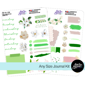
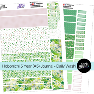
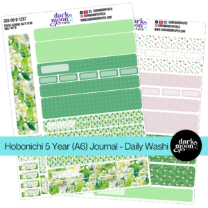
Our custom stickers are a fuss-free way to brighten up your planner pages with perfectly-sized designs that add a spark of personality to every layout.
Why use planner stickers?
Planner stickers make organizing easy, fun, and personal! Add color, creativity, and structure to every page, transforming your planner into a tool that reflects you. Perfect for tracking, decorating, and staying inspired daily!
Hello and welcome!
I’m Rachael Snow, a lifelong artist and entrepreneur, and I started Dark Moon Paper to blend my love of art, technology, and the mysterious beauty of the world around us. My sticker kits are meant to set the mood, tell a story, and give you a little escape from the ordinary.
I work from my cozy studio tucked away in the beautiful woods of Oregon, surrounded by nature and a dark night sky full of stars.